[interface] image of a laptop displaying product interface (for an ai saas company)

Airbus Experience

This case study highlights a 1.5-month project that I began during my third month at Airbus. The project focused on creating an Internal Enterprise Dashboard for Tracking Complex Aircraft Change Processes in a fast-paced, cross-functional environment. Because of Airbus’s confidentiality requirements, I am unable to show project deliverables directly. Instead, I’ll outline the design process,  from research and stakeholder interviews to co-design workshops and delivery, to give insight into the type of work I do and the challenges I solve at Airbus.
Client

Airbus

Year

Present (Ongoing Experience)

Project Type

Internal Enterprise Dashboard for Tracking Complex Aircraft Change Processes

Focus Areas

UX Research and Design

About the Project

In the aerospace industry, even small modifications to an aircraft must pass through several lifecycle phases and involve multiple stakeholder groups. Each modification can affect engineering, procurement, operations, and compliance, making the process highly complex. Without clear tools to track these steps, stakeholders risk delays, bottlenecks, and late changes that are costly and difficult to manage.
This project focused on designing an internal enterprise dashboard that enables responsible stakeholders to:

Steer the change process effectively across different phases.

Detect bottlenecks early and understand where issues are arising.

Take corrective action proactively, reducing the impact of late changes.

Ensure transparency and alignment between engineering, management, and procurement teams.

image of a creative workspace (for a social media and communication)

Exploration

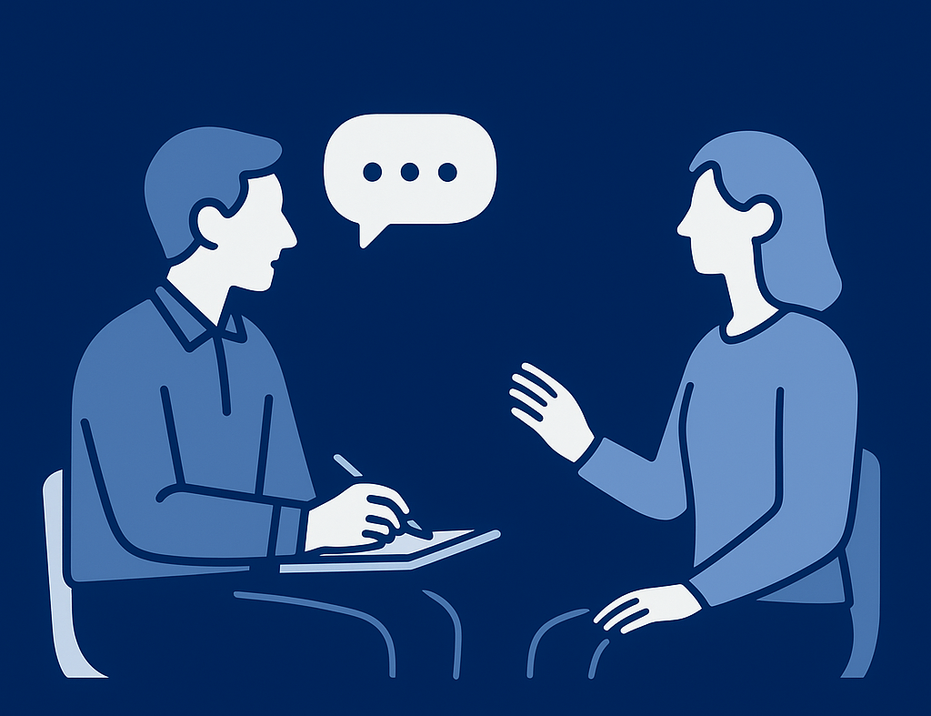
As part of the discovery phase, I conducted 5 in-depth interviews (around 75 minutes each) with different stakeholders who would be using the tool. Each interview focused on a specific phase of the engineering change process, ensuring that the design captured the unique needs and responsibilities at each stage. These sessions were closer to contextual inquiries than traditional interviews. Stakeholders shared the documents, spreadsheets, and workarounds they currently relied on to track changes. This revealed the practical realities of how work was being managed in the absence of a dedicated tool, as well as the challenges they faced.

Define – From Insights to Strategy

After completing the interviews, I analyzed and synthesized the findings in Condens, clustering insights across stakeholders and process phases. This helped me identify recurring pain points, common workarounds, and critical moments where responsibilities shifted. From this analysis, I created a Product Vision Canvas and Impact Maps to translate insights into strategy. These artifacts aligned the project with the broader objectives of cross-program initiatives, ensuring the tool would provide value not just for individual users but also for the larger organizational context.

image of a customer service representative working in a digital interface environment [digital project]

Craft – Co-Design Workshop

During the craft phase, I facilitated a co-design workshop with 8 stakeholders, structured around a diverge–emerge–converge approach. Participants worked in groups to review a mid-fidelity prototype, explore different screens, and propose ideas for structure, features, and workflows. This process not only surfaced hidden requirements but also created alignment across perspectives and generated early design directions for the interface.

image of a creative workspace (for a social media and communication)

A key highlight from this workshop was how stakeholders perceived the level of fidelity. Presenting several high-fidelity wireframes at the start can make participants feel as though the design is already complete, which may cause them to question the purpose of a co-design session. Since the real aim is to reflect and collaborate, it’s often more effective to ground the discussion in the tools stakeholders already use daily, asking what they like or dislike about them, before introducing design concepts.
In contexts like this  (internal tools with limited time and resources) a better balance is to use a single high-fidelity wireframe with limited functionality. This keeps the session focused, avoids overwhelming participants, and ensures the design remains open for collaborative input while still providing enough structure to move forward.

Following the workshop, I synthesized the outcomes and moved into the interface design phase. The insights and sketches created during the session served as a foundation for structuring layouts.

[interface] image of software interface (for a edtech)
Deliver and Learn

Deliver – Final Presentation

The delivery phase brought everything together in a structured format. I prepared a detailed presentation that outlined the defined logics, clarified workflows, and connected them directly to the interface designs. Using the Airbus design system, I produced high-fidelity screens that reflected both usability and precision. The deliverables ensured stakeholders and developers could align on not just what the tool would look like, but also how it would function at every step.

Insights – What I Learned as a Designer

Workarounds are deeply ingrained.
Most stakeholders relied heavily on Google Sheets to track and manage processes. They expected the new tool to replicate familiar spreadsheet-like functionalities. The design challenge was to integrate the benefits of these workarounds without simply recreating them, while still introducing more scalable, reliable structures.

Information hierarchy is everything.
Users were managing 10+ parallel sheets, each containing different slices of the process. Some needed a quick overview of progress; others needed to drill down into detailed technical data. Designing for both perspectives meant creating a layered hierarchy that balanced clarity and depth without overwhelming users.

Different stakeholders, different worlds.
Each group focused on their own slice of the process, using domain-specific terminology, acronyms, and requirements. Capturing all of this within a short timeframe required not just listening, but translating technical language into design logic.

Design as a communication bridge.
Project managers collected requirements, but they were often difficult for developers to translate into features. I acted as the bridge between business and technical teams, ensuring every component, label, and field in the prototype matched precise data needs. The prototype had to function almost as a working tool,  because what I designed is exactly what developers would implement.

Precision is critical in enterprise tools.
Unlike consumer-facing products, internal enterprise systems leave very little room for ambiguity. Even small misalignments in labels, fields, or flows could cause confusion across teams. This taught me to push for exactness in every detail of the interface.